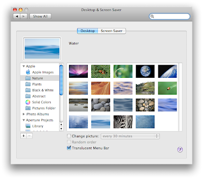
The menu bar transparency is now optional!
The transparent menu bar in Leopard really wasn't accepted too well when it came out. There were many third-party applications to disable it. It is great to see that Apple listens, because the 10.5.2 update brought another new feature and it is the possibility of turning off the transparency. Here is where you can get this new feature:
1. Open System Preferences.
2. Click on "Desktop & Screen Saver".
3. Click on the "Desktop" tab.
4. There is a new "Translucent Menu Bar" checkbox.

1. Open System Preferences.
2. Click on "Desktop & Screen Saver".
3. Click on the "Desktop" tab.
4. There is a new "Translucent Menu Bar" checkbox.


10 Comments:
Thanks so much! I was hoping the transparency was going to optional!
Awesome tip !!
Personally, I strongly prefer the menu bar transparent.
Thank goodness Apple is finally starting to listen to their customers.
Keep the tips coming and THANK YOU VERY MUCH for your contributions !! :o)
Unfortunately not for all OS X Leopard users. If you have a Mac Mini or you were impatient and hacked the menubar to solid, the option doesn't appear in that preference pane.
My MacBook has the option, but my Mac Pro does not. I hacked my Mac Pro and don't remember what I did to change the menubar to solid. So I don't have the option on my Mac Pro.
Fortunately, Mac Pilot has an option to set the transparency level of the menubar that works for me so I can adjust my menubar that way. :)
Not all macs appear to be equal. I have a G4 iBook. My wife runs an Intel Core 2 Duo Mini. Both have been updated to 10.5.2. She has the optionally-transparent Menu Bar. The G4 Menu Bar is solid and no transparency option is offered.
Her Time Machine screen is animated with moving stars and a brightly-lit swirl in the distance - a real work of art. The G4 Time Machine screen lacks the swirl, and the stars are not in motion. I've developed a severe case of Time Machine envy. My wife feels sorry for me, but has not offered to swap machines!
The first clue that the G4 is being left behind was the size of the 10.5.2 update. It was nearly twice as big for the Intel Core 2 Duo than for the G4. I'm still happy with my faithful iBook, but I note a distinct cooling in my attitude.
any idea why i dont have nearly as many as the background options as i should in ichat? i have 4 pages: 1) the original backgrounds, 2) the ones that change how i look like bent, twirl, tunnel, etc. 3) yosemmete, dots, roller coaster, etc. and 4) user created backgrounds.
i know there should be like 4 more pages that put me in time square, rotate me in a square and a bunch of other fun stuff.
i do have the most updated ichat...any ideas?
thanks,
zeke
Zeke,
Do a search here on this site for ichat. I believe on December 28 there was a link to download the additional ichat background options.
Zeke
this is the link from apples websites it gives you 48 more iChat backgrounds
http://www.apple.com/downloads/macosx/email_chat/moreichateffects.html
The menu bar can also be resized by placing the pointer on the dotted separation, it changes to a bar with arrows and if you drag it up or down the whole bar is resized
Thanks helped alot. Since i have my menu bar black now the inverted translucent bar was annoying!!!
Post a Comment
Subscribe to Post Comments [Atom]
<< Home